Contents in this page:
- Quick Recap
- The Landscape of School Shootings
- A Model of Who Leaves
- Main Result: Enrollment Drops
- Who Leaves? Composition Effects
- Between-County Segregation Rises
- Spillovers: Is There a Safe School Nearby?
- Heterogeneity and Robustness
- Conclusion
- Let’s Stay in Touch!
1. Quick Recap
- What’s this about? Disadvantaged neighborhoods remain disadvantaged, and one reason may be crime holding them back. But crime and residential choice are jointly determined: families sort on safety, and where families sort determines where crime occurs. School shootings break that loop. Their location is not random, but their timing is unanticipated, and that is all a difference-in-differences design needs.
- Main contributions. Three. First, I locate the geographic scale at which flight from a shooting becomes segregation, measuring sorting between schools within a district, between districts within a county, and between counties within a state. This reconciles the school-level enrollment declines and the individual-level migration nulls found in the existing literature. Second, I use a shooting as an unanticipated shock to a single priced amenity — school safety — sidestepping the usual simultaneity between household preferences and neighborhood quality. Third, I supply a sorting model with signed comparative statics, so the empirics test predictions rather than rationalize findings after the fact.
- How did I estimate this? ~2,300 shootings across the United States between 1990 and 2022, each hitting a different place in a different year. Schools within 500 meters of a shooting are treated; never- and not-yet-treated schools are the controls. I use the Callaway and Sant’Anna (2021) estimator to recover group-time average treatment effects robust to treatment effect heterogeneity, estimated by outcome regression with one anticipation period.
- What did I find? Enrollment falls by 4% on average — about 32 students at the average shooting school of 773 — and roughly 10% at longer horizons after a fatal shooting. The decline sits in the highest grade a school offers, not the lowest: students are leaving, not failing to arrive. The share of poor students among those who remain rises, though imprecisely estimated. Between-school and between-district segregation are precise nulls; between-county segregation rises by 0.022, about 40% over its baseline. Families are crossing county lines, not switching schools across town.
- Do I trust these results? The enrollment effects, yes. They are stable across treatment radii from 250m to 5km, unchanged when I drop every control school that sits within 50km of any shooting, and they clear a randomization-inference placebo test (p = 0.020). Schools that close entirely are dropped from the estimation sample, so the estimated effects are a lower bound. The segregation and composition results are interpreted with more caution.
2. The Landscape of School Shootings
Incidents of school shootings have increased dramatically in the United States. I use the K-12 School Shooting Database (Riedman, 2024), which defines a school shooting as any incident in which a gun is brandished, shots are fired, or bullets strike school property, regardless of time of day or day of year. This broad definition captures the full range of incidents that families may plausibly respond to.
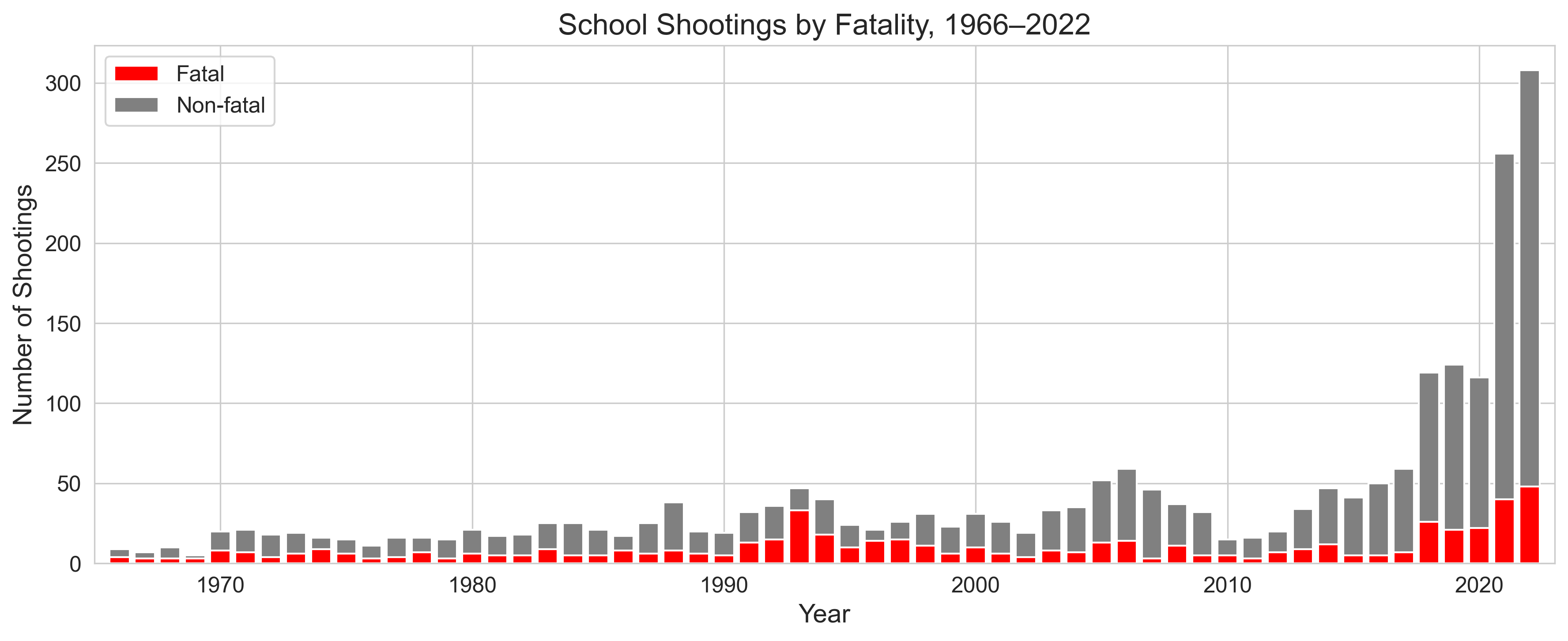
The 1990s averaged roughly 30 shootings a year while the early 2020s have had over 200 shootings a year. The safest year in the past three decades saw 19 shootings (1990) and the worst saw 308 (2022), a more than fifteenfold increase. The database records roughly 2,600 incidents since the 1960s, about 2,300 of them inside my 1990–2022 study period, and roughly a quarter of them fatal.
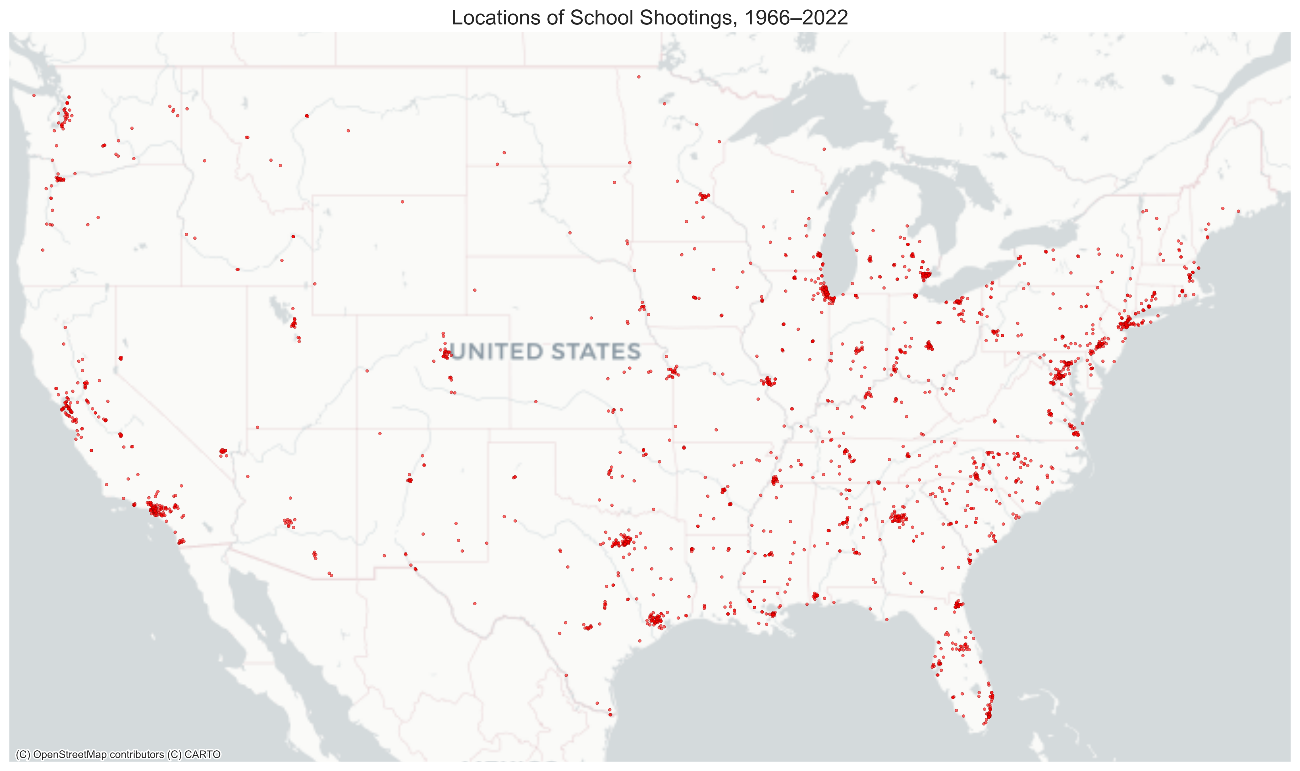
Shootings are widespread but not randomly placed. This is why my empirical design leans on when a school was hit rather than whether.
Two phenomena under one name. It is worth being explicit about what this broad definition pools. The first type is the rarer but heavily publicized indiscriminate rampage shooting. These include the Columbine, Sandy Hook, Parkland, Santa Fe and Uvalde shootings, and they fall disproportionately on whiter, more affluent, rural and suburban districts. The second type is everyday gun violence at schools, common in urban areas and concentrated in disadvantaged communities. I pool the two because a shooting of either kind degrades a priced local amenity, the safety of the school, and a family weighs that loss against the cost of leaving. Whether the two types provoke the same response is a testable question rather than an assumption, and the fatal versus non-fatal split in Section 4 is where I test it.
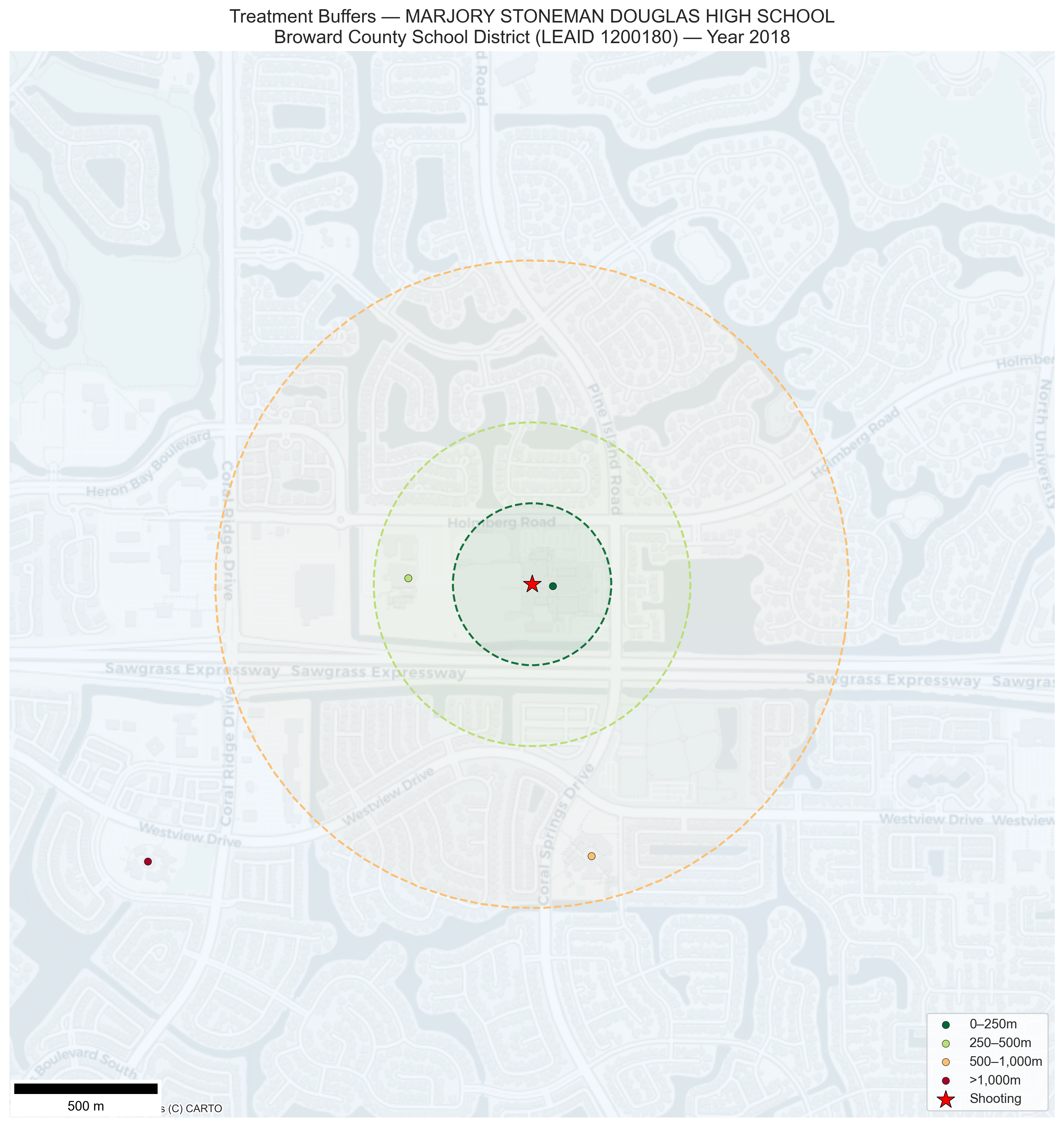
Identifying the treatment. I classify a school as treated if it lies within 500 meters of a shooting identified in the K-12 School Shootings Database. By using a spatial join, I capture multiple schools that may be affected by the same shooting. The figure below illustrates this for Marjory Stoneman Douglas High School in Parkland, Florida (February 14, 2018).
Interactive Map
The gruesome mass shooting at Marjory Stoneman Douglas High School (serving grades 9–12) occurred in proximity to Westglades Middle School (serving grades 6–8). A match on school name, or a 250 meter buffer, would have counted only the high school. The 500m buffer also catches Westglades Middle School across the yard, which is the school that the perpetrator himself had attended. At 1km the buffer reaches Country Hills Elementary School, a three-minute drive away. Testimony from a school police officer, Dave Dittman, jumping into action to help protect the students at Marjory Stoneman Douglas High School, shows how resources and individuals in the nearby community are pulled in. The spatial join therefore captures schools that are affected by proximity.
3. A Model of Who Leaves
It helps to have a framework that says who should leave and how far. The model is not meant to be estimated structurally but rather to organize our thoughts and produce signed predictions.
Take school safety to be an amenity that families pay for, and a shooting to be a sudden shock of size σ to it. Two ingredients of the model produce the predictions.
The first is single crossing. This means that the marginal willingness to pay for safety rises with household socioeconomic status. In other words, richer families value the lost safety more.
The second is a moving cost with two properties. It is regressive (i.e. lower for richer households, who face fewer credit constraints and lighter relative transaction costs) and it is increasing in geographic scale (i.e. switching schools is cheaper than moving within a district, which is cheaper than crossing a county line).
A family leaves when the privately valued safety loss exceeds the cost of reaching the nearest genuinely safe substitute. The benefit rises with income and the cost falls with it, so the two cross exactly once, at a cutoff y*. Families above the cutoff leave and families below it stay.
That single threshold generates the following predictions:
- P1. Enrollment falls, because some positive share of families clears the threshold. → §4
- P2. The leavers are non-poor, because exit comes from the upper tail. Seats they vacate are filled, if at all, from below the cutoff, so the poverty share among those who stay rises. → §5
- P3. Severity matters. A bigger shock — a larger σ — steepens the benefit line and lowers the cutoff, so fatal shootings should produce larger exits than non-fatal ones. → §4
- P4. Cheaper switching means more exit. More same-level schools in the district, or open-enrollment rules that permit switching, lower the cost at small distances and should enlarge the outflow. → §8
- P5. Scale is not pinned down by the threshold alone. Where re-sorting shows up depends on the cheapest scale d* at which a safe substitute actually exists. If neighboring schools are hit by the same shock, they are not safe substitutes, and d* lies farther out. → §6
If nearby schools are contaminated by spillovers, the move-out condition fails at the between-school and between-district margins, and re-sorting should appear only at a larger scale. That is an assumption I go on to test rather than assert.
4. Main Result: Enrollment Drops
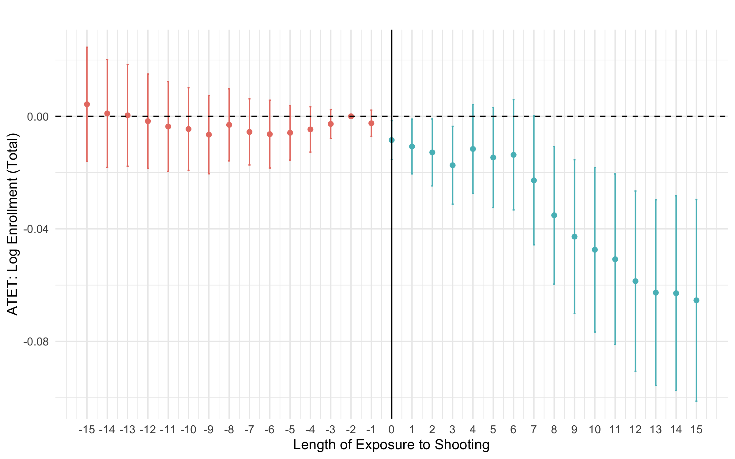
The dynamic event-study plot above shows the Average Treatment Effect on the Treated (ATT) for all school shootings. A joint test of the pre-treatment coefficients does not reject flat pre-trends (p = 0.92), supporting the parallel trends assumption.
The overall ATT on log enrollment is –0.042. The average shooting school had about 773 students before the shooting, so a 4% decline is roughly 32 students. The effect is not a one-off level shift either: it deepens with time since the shooting. This is P1.
These magnitudes line up with the literature: Yang and Gopalan (2023) find 4–5% at the school and district level, Beland and Kim (2016) find 5.8% in earliest-grade high-school enrollment, and Abouk and Adams (2013) find 0.4–1.3% state-wide.
Fatal shootings: a larger shock, a larger response
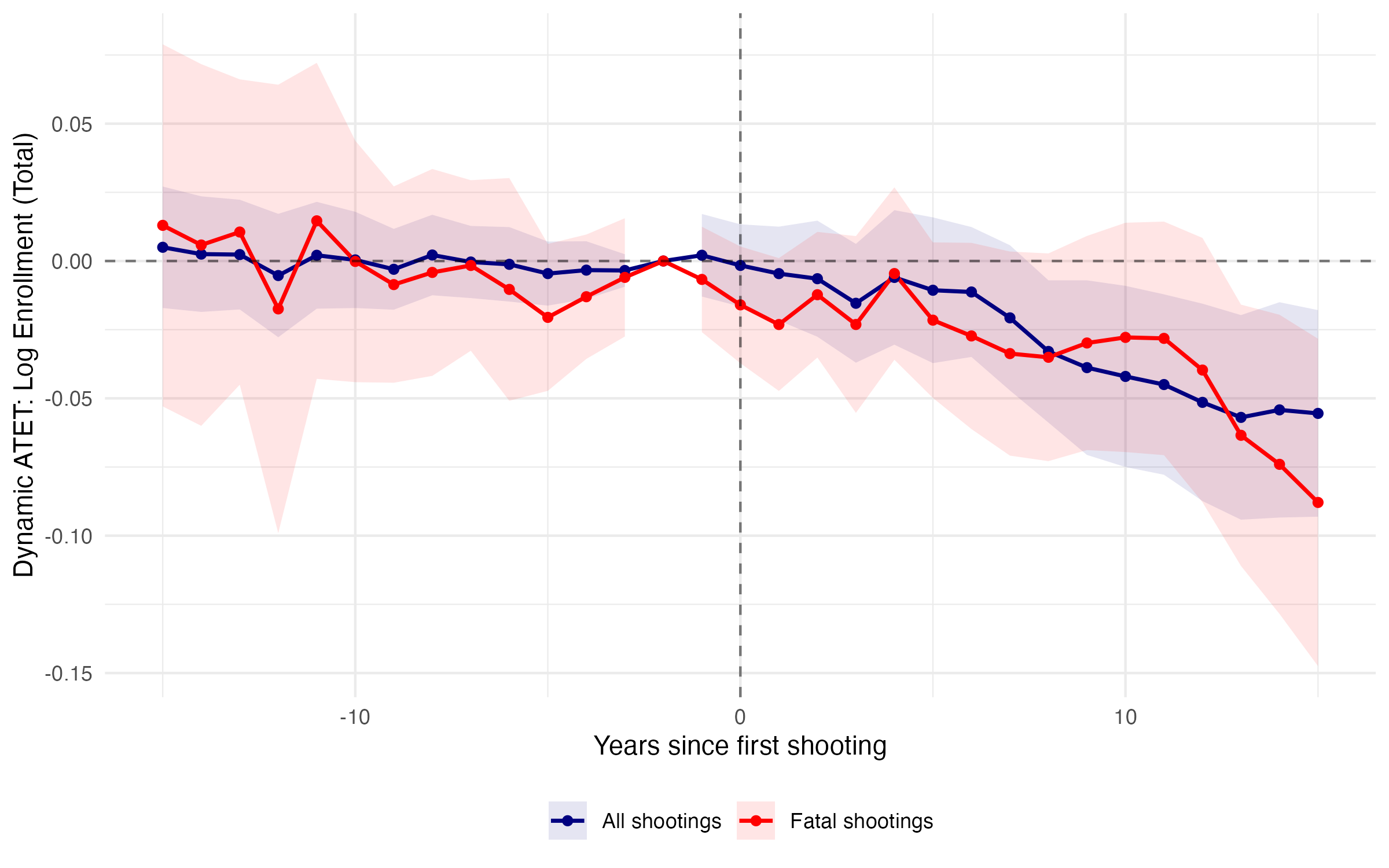
P3 predicts that a larger σ lowers the cutoff and pushes more families over it. Restricting the treatment to fatal shootings gives an overall ATT of about –7%, reaching approximately –10% at longer horizons, against –4.2% for all shootings pooled. Putting these estimates in perspective, enrollment following the biggest mass shootings in the U.S. declined by 5%, 12%, 1% and 7% for the Columbine (1999), Sandy Hook (2012), Parkland (2018), and Santa Fe (2018) shootings.
Which margin? Entry or exit. A school can empty because families leave or because families stop arriving, and the two have very different interpretations. Splitting enrollment by the lowest versus the highest grade a school offers separates them.
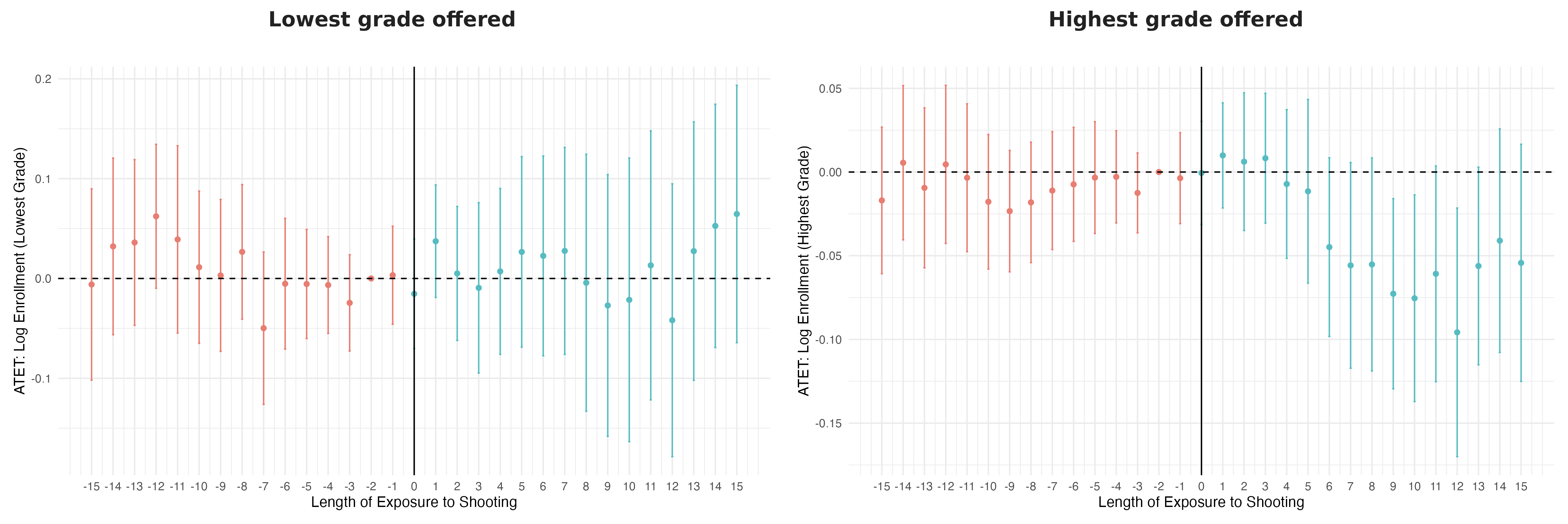
Enrollment in the lowest grade is unchanged (0.005, standard error 0.039). Enrollment in the highest grade falls by about five percent (–0.050, standard error 0.020). A shortfall of joiners would show up at the entry grade, where intake occurs, and it does not. A shortfall concentrated at the top of the grade range points instead at incumbent students leaving before finishing the grades their school offers.
The pattern is consistent with families voting with their feet: after a shooting, the affected school’s enrollment shrinks and continues to shrink in subsequent years as family decisions compound.
5. Who Leaves? Composition Effects
Is it random which students leave? The share of Free or Reduced Lunch Eligible (FRLE) students — a standard proxy for household poverty in U.S. school data — answers this question.
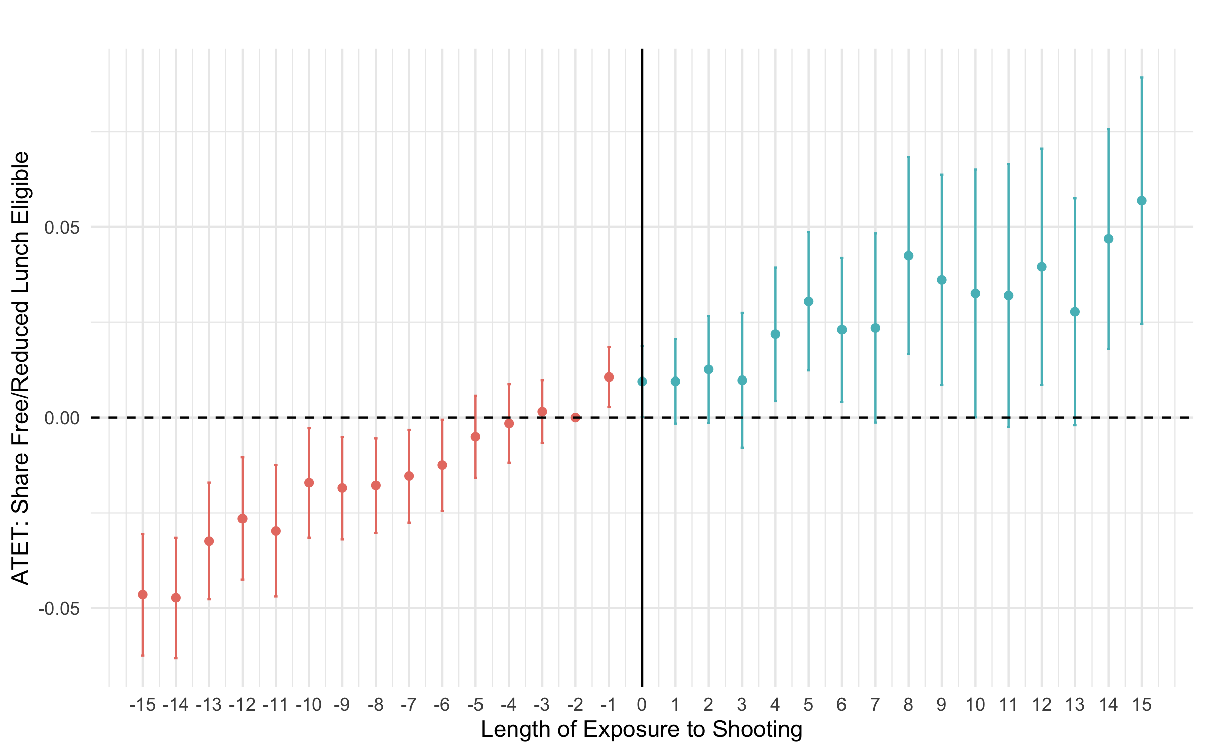
The share of FRLE students rises after a shooting, by about 1.4 percentage points. That implies students who remain are disproportionately from lower-income households, while non-poor families are the ones leaving. This is P2.
However, the estimate is imprecise (standard error 0.008, so significant only at the 10% level), and more importantly, a joint test rejects flat pre-trends for this outcome (p = 0.001). The share of poor students at schools that would later experience a shooting was already moving before the shooting. I therefore read this as suggestive of selective exit rather than as a clean causal estimate, and lean instead on the grade-level evidence above, which does clear its pre-trend test.
6. Between-County Segregation Rises
Do non-poor families simply switch schools within the same district or do they move further away? The former is relevant for school choice and the latter for residential relocation.
I estimate the same staggered Difference-in-Differences on socioeconomic segregation at four geographic scales: between schools within a district, between geographic districts within a county, between administrative districts within a county, and between counties within a state.
The outcome at each scale is the Normalized Exposure Index for Free Lunch vs. Non-Free Lunch recipients. Read it as a dial from 0 to 1: at 0 every subunit looks exactly like the wider area, at 1 the two groups are completely separated.
It is constructed as the enrollment-weighted variance of subunit poverty shares around the wider area’s mean, divided by its theoretical maximum. That division is what makes it the right measure here — it strips out changes in the overall share of Free Lunch recipients, leaving pure distributional sorting rather than mechanical compositional shift.
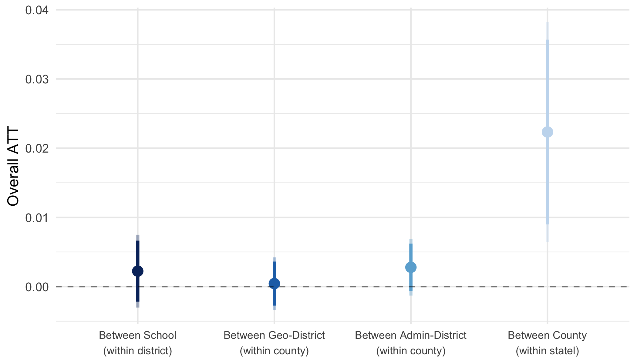
There is no detectable effect on between-school or between-district segregation once compositional change is accounted for. The between-school estimate is 0.002 (standard error 0.003); between geographic districts it is 0.000 and between administrative districts 0.003. These are precise nulls, not underpowered ones. The action is at a larger scale: between-county (within-state) segregation increases, with an overall ATT of approximately 0.022 (standard error 0.008). This is P5.
How big is 0.022? Among treated states the between-county index averages 0.057 before the shooting, so the estimated increase is roughly 40% over baseline.
Dynamic treatment effects on segregation by geographic level
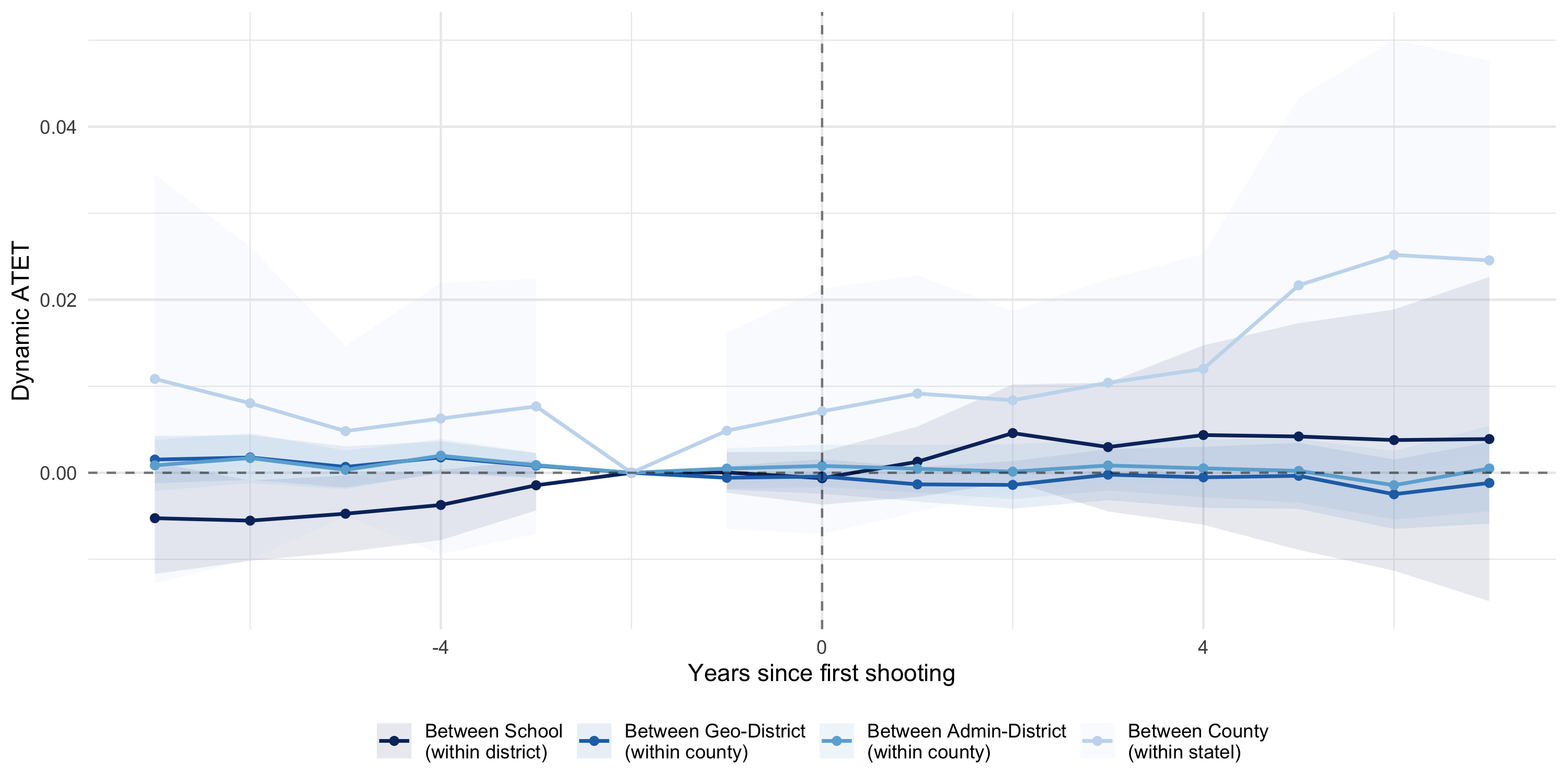
The event-study reveals that the between-county effect is not immediate. It emerges gradually from around three years post-shooting and continues to grow over the observed horizon. This is in line with residential relocation rather than school switching. Pre-period estimates are flat across all scales, though note that the formal joint pre-trend test I report for the school-level estimates is not computed at these scales, so the flat pre-periods rest on the individual coefficients rather than on a joint test. The between-school and between-district series are precise nulls throughout, ruling out school-switching within a district as the primary mechanism.
Families who leave are not simply enrolling their children in a different school across town. They are crossing county lines. This is residential flight, not simply school choice.
This also squares my results with the individual-level literature, which mostly finds nulls on mobility. Cabral et al. find no increase in school switching or exit among exposed Texas students; Sezer finds that exposed individuals move less by age 30, not more. Neither conflicts with what I find, because we measure different populations on different margins. Their designs follow the directly exposed, who are disproportionately lower-SES and least able to move. My county-level effect reflects all families in the area, most of whom were never directly exposed. Unchanged individual exit rates and aggregate between-county sorting can coexist, provided those who leave differ in composition from those who stay.
The effect is persistent, county-wide, and accumulates with each additional shooting. Because shootings are frequent and cumulative across U.S. counties, the aggregate contribution to between-county socioeconomic segregation may be substantial.
A further complication is that I can only observe public school data. To the extent that families leave the public school system entirely, we may see enrollment drops that are not accompanied by any detectable sorting within the public school system, meaning the true segregation effect could be even larger.
7. Spillovers: Is There a Safe School Nearby?
P5 rests on a premise: a family looking for a safer school cannot find one close by, because the schools nearby were hit by the same shock. Three exercises test it.
The effect reaches far past 500m.
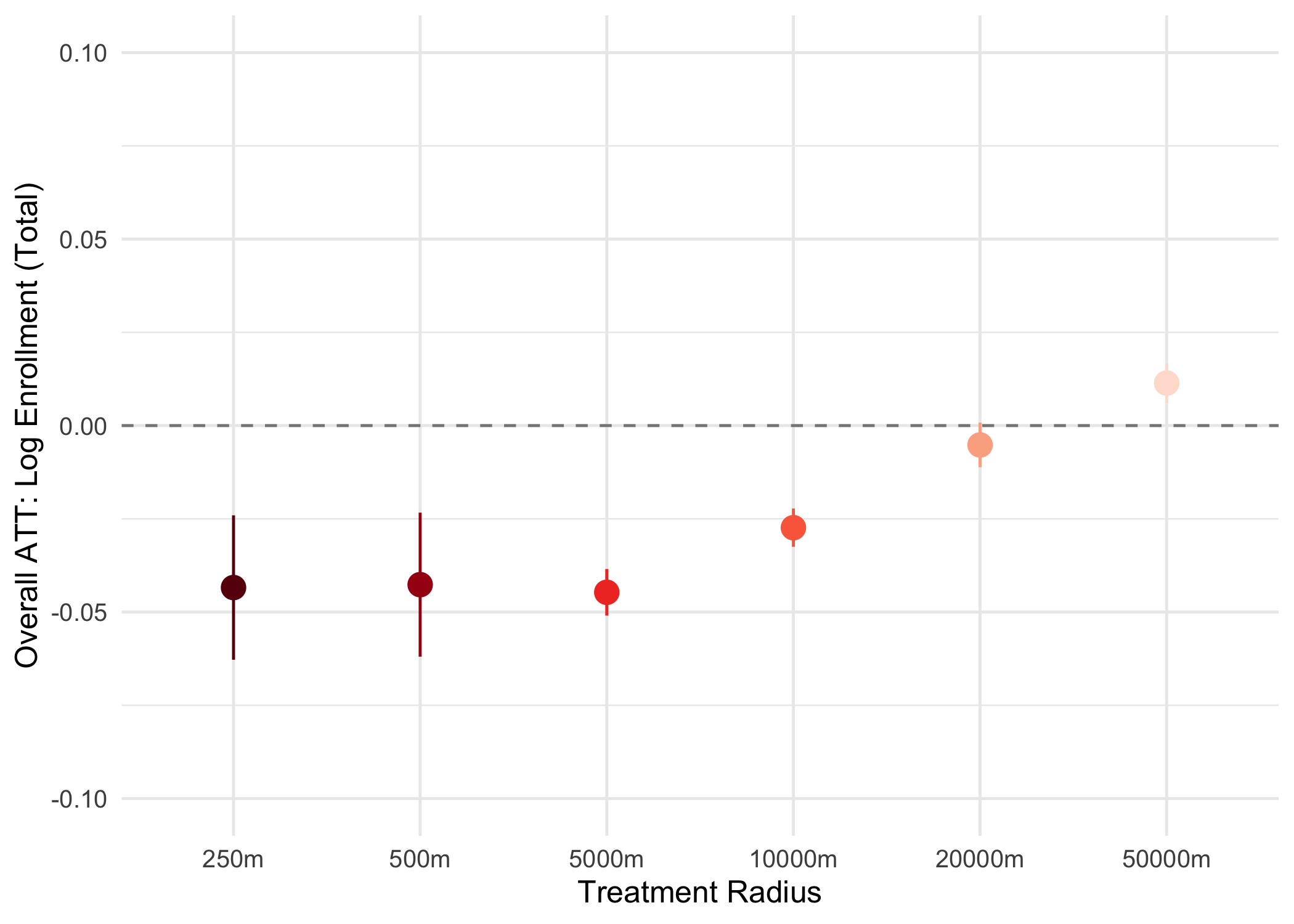
The ATT is stable from 250m to 5km (–4.3%, –4.2%, –3.9%), still negative at 10km (–2.4%), near zero at 20km (–0.5%), and positive at 50km (+0.9%). Schools kilometres from a shooting lose students too, so they are not safe substitutes. The sign flip at 50km is what one would expect if distant schools receive the displaced students. For scale, 50km is Dallas to Fort Worth.
Dynamic treatment effects by radius
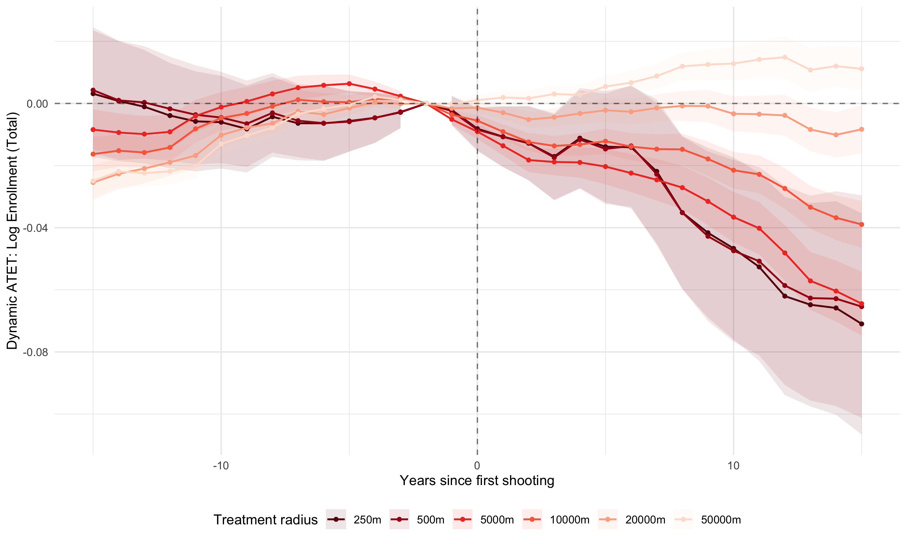
The pattern holds across the full post-shooting horizon and not just on average. At close radii (250m–5km) the decline emerges in the shooting year and deepens over time. At 50km, the trajectory turns positive after a few years, tracing the gradual absorption of displaced students by distant schools.
Rings separate the effect at a distance from the effect it contains.
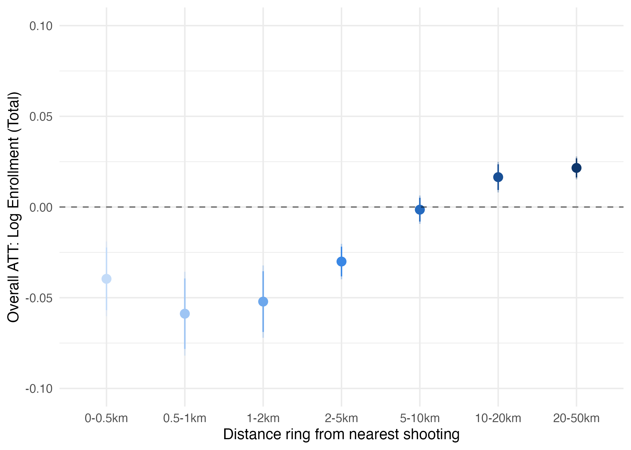
The radius sweep expands discs, so every estimate nests the focal school’s own effect. Disjoint rings do not. Each ring treats only schools whose nearest shooting falls inside it, against a shared control pool of schools never within 50km of any shooting. The innermost ring (0–0.5km) reproduces the headline effect at –0.040; by 5–10km it is –0.002. Contamination is real, but local. It fades within about five kilometres.
Pre-trends in the outer rings
Four rings fail their pre-trend tests. The two outermost drift upward from roughly ten years before treatment and simply continue through it, so their positive coefficients are a pre-existing trend rather than a response to a shooting. Composition is the likely reason: the control pool is fixed at roughly 9% City and 48% Rural, while the treated schools rotate from 54% City in the 1–2km ring to 10% City in the 20–50km ring. Urban schools were already on a different enrollment path from rural ones. The two rings I lean on clear their tests comfortably (p = 0.81 at 0–0.5km, p = 0.50 at 5–10km).
Purging the controls does not move the estimate.
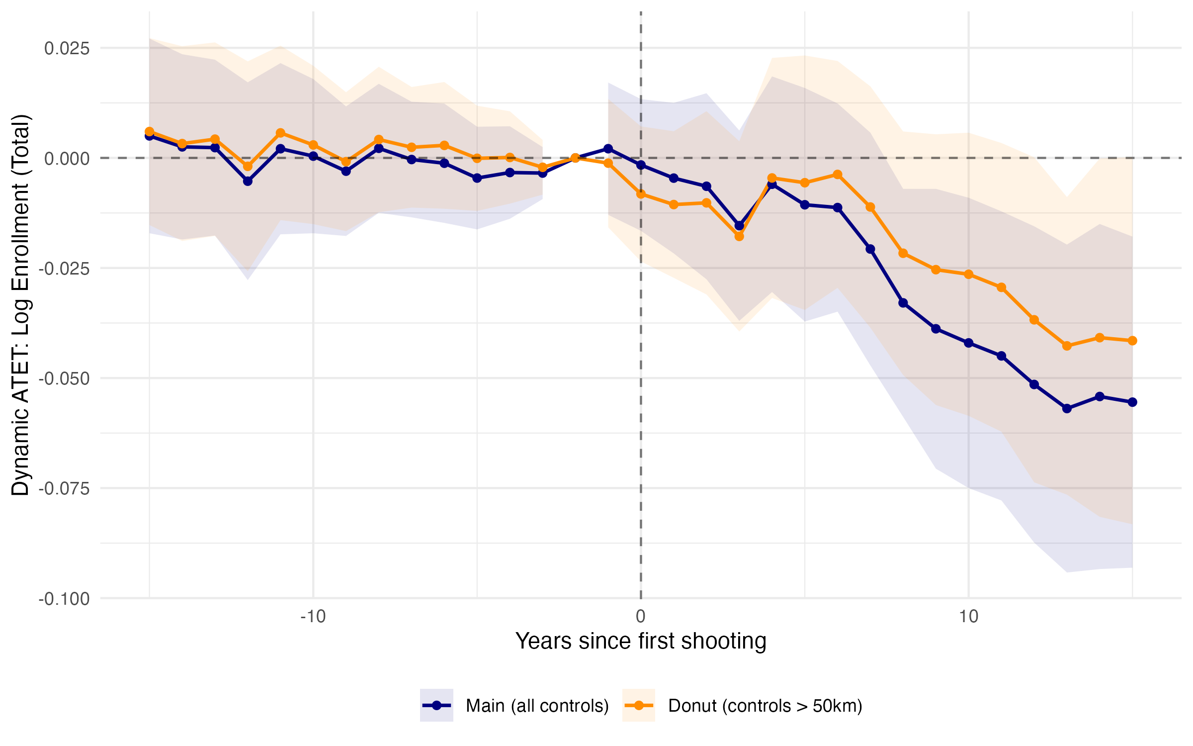
If schools just outside the 500m ring are themselves affected, then using them as controls understates the true effect. Restricting the control pool to schools never within 50km of any shooting, i.e. 1,307 treated against 11,033 controls instead of 51,568, gives –0.033 (standard error 0.013), indistinguishable from the baseline, with a pre-trend p = 0.94.
Nearby schools are affected, so they are not safe substitutes and d* lies farther out. The precise nulls in Section 6 are what we expect if there are negative spillovers within-district and within-county.
8. Heterogeneity and Robustness
Four further exercises. The headline of each is below; the estimates and figures are in the drop-downs.
- Background county violence. Schools in the highest-violence counties lose –4.7% (standard error 2.6); the safer quartiles are indistinguishable from zero. A shooting is the last straw for families already near their tolerance threshold.
- P4 fails, twice. Where between-district switching is barred the decline is –11.2% (standard error 2.4), against –1.3% where it is permitted. And high schools in the largest districts show effects that are positive and significant. Both are the opposite of what P4 predicts.
- Randomized timing. The actual ATT sits in the tail of 500 placebo reshuffles of treatment years (p = 0.020).
- School closures. About 1 in 66 shooting schools closes within five years and drops out of the sample, so the enrollment estimates are a lower bound.
Open enrollment laws
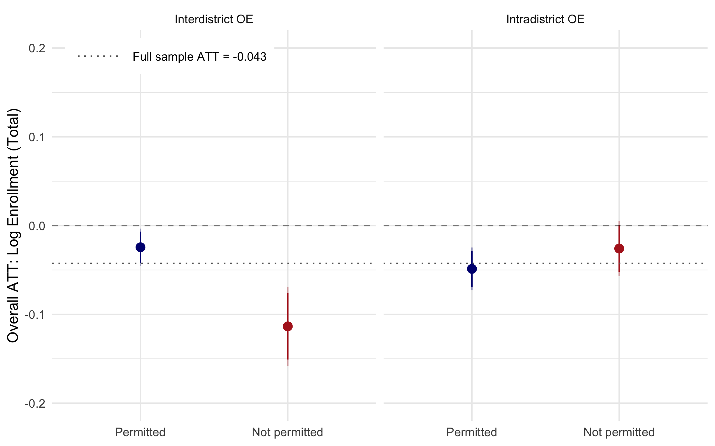
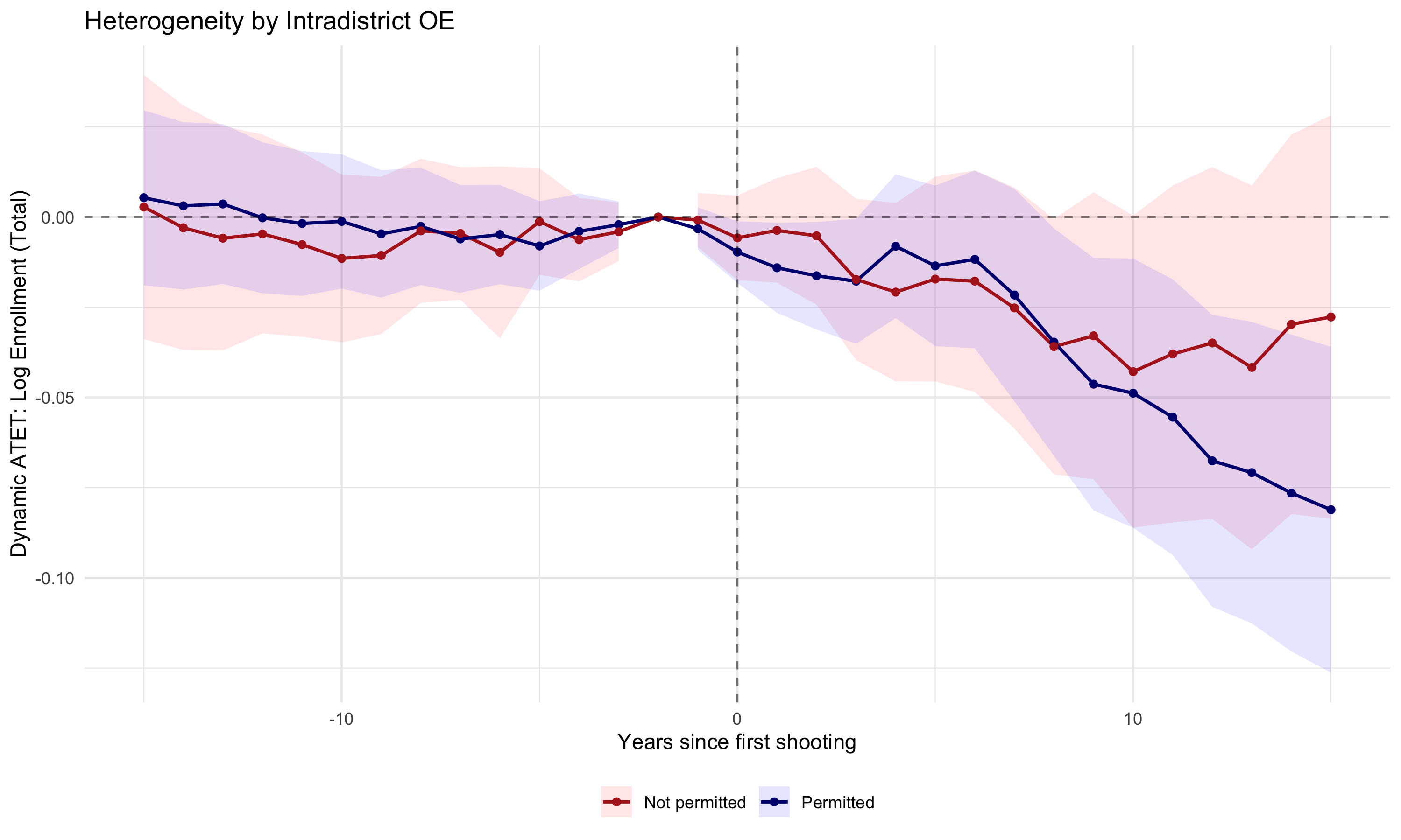
Where within-district switching is permitted the decline is –2.9% (standard error 1.7), against –3.7% (standard error 1.7) where it is barred; the two are not statistically distinguishable. Where between-district switching is not permitted the decline is –11.2% (standard error 2.4), against –1.3% (standard error 1.4) where it is permitted.
Two readings. First, the alternatives inside a treated district are hit by the same shock, so a within-district transfer buys little safety, consistent with the intradistrict null here and with the between-school segregation null in Section 6. Second, the not-permitted arm rests on just seven states, and 9 of the 10 most affected states have strict interdistrict rules, so it is weakly identified: the largest decline is being measured in the sample of states that are most affected.
Within-district (intradistrict):
Between-district (interdistrict):
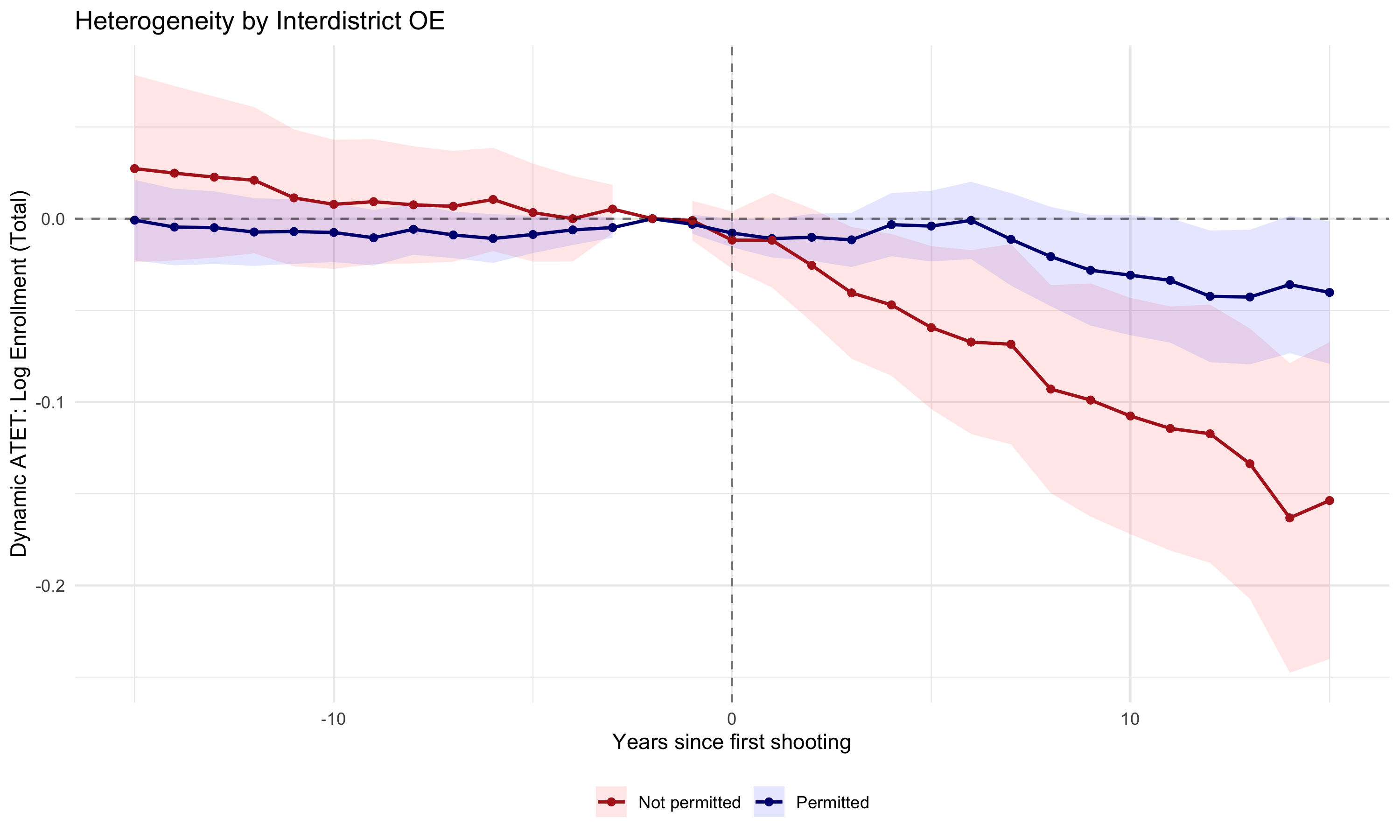
Pre-trend tests pass comfortably in all four arms (p = 0.83 and 0.74 for intradistrict permitted and not permitted; p = 0.52 and 0.99 for interdistrict).
Background county violence
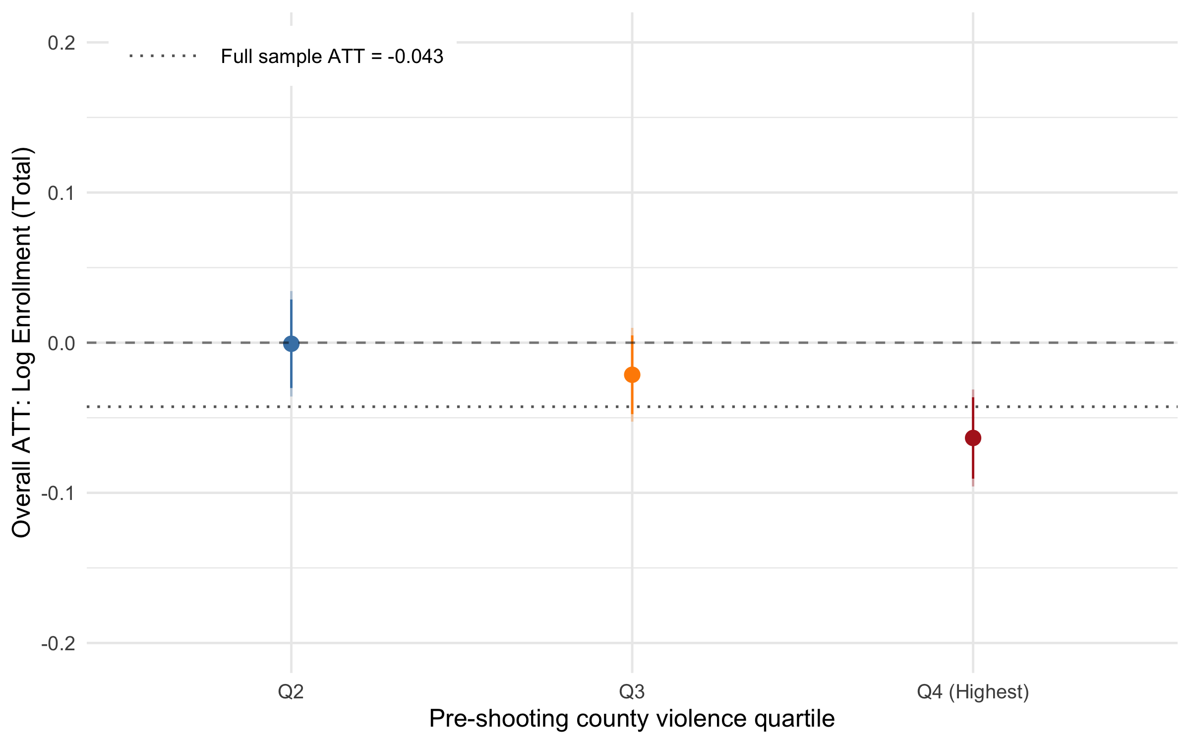
Splitting by quartile of pre-shooting county homicide rate (FBI Supplementary Homicide Reports), the highest-violence counties (Q4) lose –4.7% (standard error 2.6). The others are near zero: –0.8% in Q1, +0.8% in Q2, –2.2% in Q3, none distinguishable from zero.
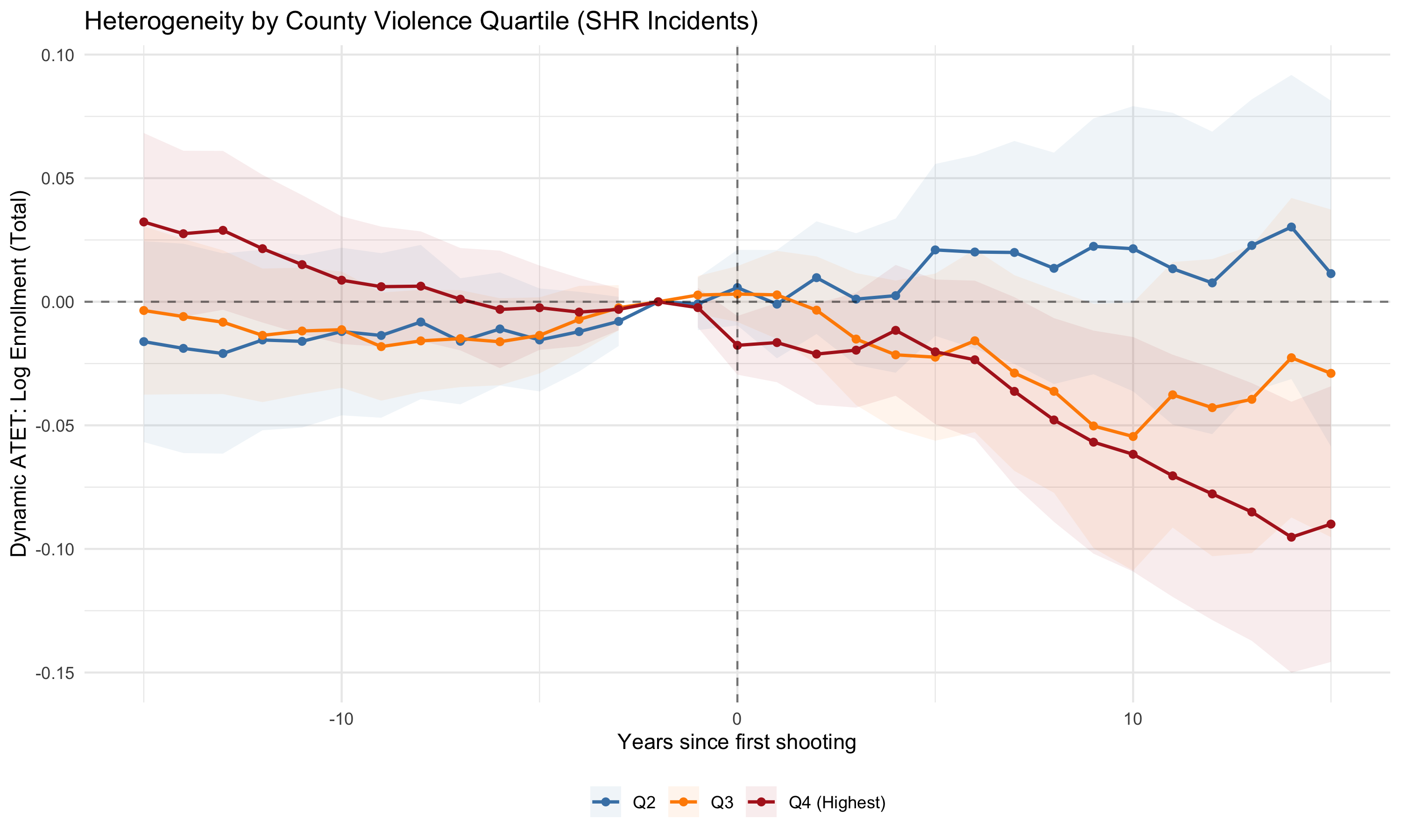
In the most violent counties effects emerge early and deepen over time. Elsewhere the confidence intervals include zero throughout. Q4 is what drives the overall negative effect.
Number of same-level schools in the district
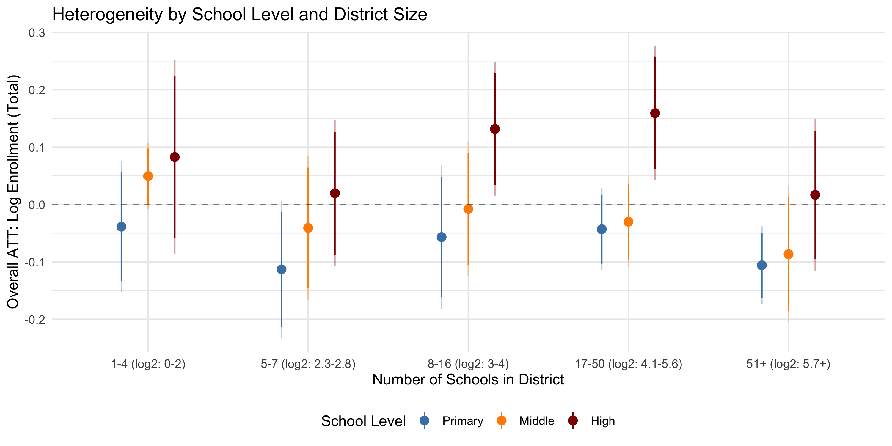
If a shooting hits the only high school in a district, there is mechanically no within-district alternative. Three patterns. Effects are more negative for primary schools than for middle or high schools in every district-size bin, consistent with most shootings occurring in high schools but those in elementary and middle schools being deadlier. Effects are more precisely estimated in larger districts, in line with shootings occurring primarily in urban areas. And high schools in the largest districts show positive, significant effects — enrollment goes up — which runs directly counter to P4. One possible explanation is that districts with many schools sit in cities households do not leave for other reasons, so a shooting reshuffles students within the district rather than out of it.
Randomized timing assignments
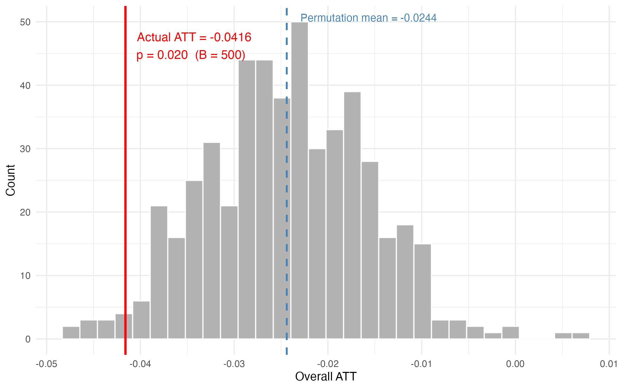
The design relies on the timing of shootings being exogenous. Reshuffling treatment years among the treated schools 500 times, only 9 placebo runs produce an absolute effect at least as large as the actual ATT of –0.042, giving a two-sided permutation p = 0.020.
The permutation distribution is not centred on zero but on –0.024, by construction: reshuffling reassigns treatment years while leaving the outcome data untouched, so permuted windows that overlap real post-shooting years inherit part of the true effect. Measured against the distribution's own centre, the observed ATT gives p = 0.040.
School closures
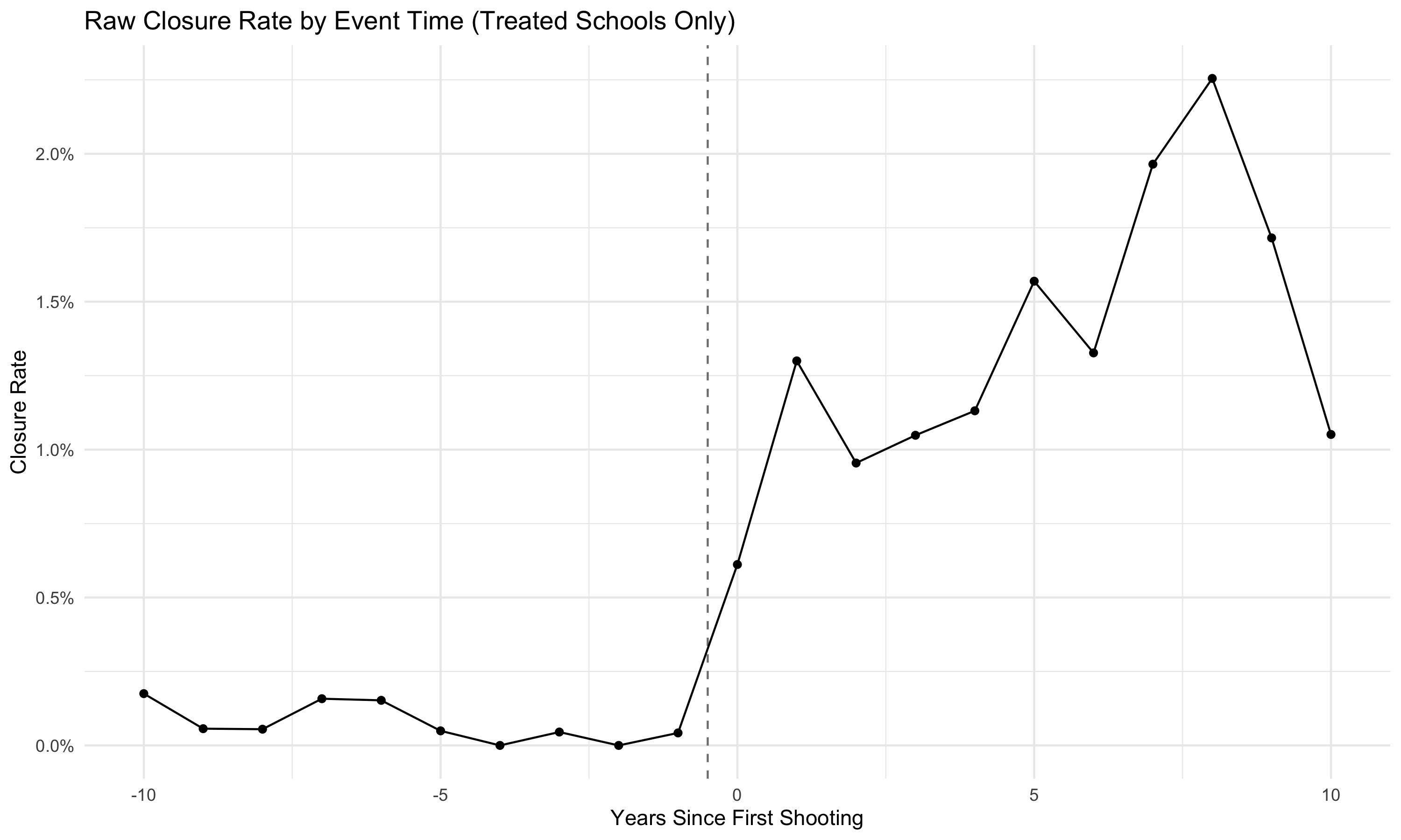
The raw closure rate among ever-treated schools is close to zero before the shooting year and rises to around 1.5% five years after, approximately 1 in 66. Once a school closes it disappears from the sample, so the enrollment estimates are computed only on survivors. The schools that close are presumably those with the most severe declines, so the true average effect is larger than the –4% estimated here. Neighbouring schools also lose students, so any comparison school close to a shooting understates the gap. Both forces push the measured response toward zero.
9. Conclusion
- School shootings affect total enrollment negatively, by about 4% or 32 students at the average affected school, rising to roughly 10% at longer horizons after a fatal shooting
- The decline sits in the highest grade a school offers and not the lowest, which locates it in students leaving rather than students never arriving
- A greater share of remaining students at the affected school are poorer students, though that estimate fails its pre-trend test and is reported as suggestive
- There is no detectable effect on between-school or between-district segregation, but between-county segregation rises and builds gradually over three or more years post-shooting.
- This points to residential relocation across county lines as the dominant sorting mechanism: families with means move away, sorting neighborhoods by wealth and leaving behind the most vulnerable students
- The scale carries the policy implication. Widening school choice within a district operates on a margin where nothing much happens, because the alternatives inside the district are hit by the same shock. Disadvantaged neighborhoods stay disadvantaged partly because violence moves the families who can afford to move, and it moves them past the district line.
10. Let’s Stay in Touch!
I’m glad you’ve made it this far and thanks for your interest in my work!
If you’d like to discuss the paper, share related findings, or just say hello, let’s grab a coffee (we’ll exchange contact details or reach out here marcos.demetry@lnu.se).
I’m broadly interested in urban economics and segregation (what drives the sorting of people across neighborhoods and schools?) and crime economics (how does exposure to crime shape economic decisions and outcomes?). School shootings sit at the intersection: they are a form of crime exposure that directly affects one of the most consequential economic decisions a family makes — where to educate their children.